.png)
Rutgers University, as the largest university in New Jersey, offers a vibrant campus life full of events, clubs, and opportunities. However, the absence of a centralized platform made it difficult for students to stay informed and connected. Inspired by my own challenges as a Rutgers student, I created RU There Yet?, a mobile app designed to foster community bonding and streamline campus interactions. The app is meant to bring multiple aspects of student life—communication, event discovery, and club exploration—into one unified space, empowering students to feel comfortable navigating campus life.
One of the biggest challenges was tackling Rutgers’ sheer size and diversity—students had vastly different needs, from busy club leaders trying to recruit members to first-years looking for friends. Existing platforms like Discord didn’t feel personalized or trustworthy enough, and students struggled with scattered information about events and clubs. On top of that, I had to make the app simple enough for everyone to use, even if they weren’t super tech-savvy, all while balancing a tight timeline to create and test a working prototype.
I connected with over 50 Rutgers students through surveys and interviews to deeply understand their struggles and crafted a prototype that felt like it truly belonged to them. Working with groups like the Rutgers Rock Climbing team helped me create features that felt personal, like real-time messaging, event highlights, and club discovery tailored to individual interests. The end result was a design that felt simple, engaging, and uniquely Rutgers.
Type
Mobile App Design
Role
Research, Development, UX/UI
Timeline
Jan-April 2024
Understand Campus Needs: Identify gaps in event discovery, club involvement, and peer connections.
Assess Current Tools: Analyze how students use platforms like Discord and GroupMe to understand limitations.
Explore User Motivations: Dive into what drives students to participate in events and join clubs.
.png)
.png)
01 DisconnectionCurrent tools like Discord and Slack are not designed specifically for Rutgers students, resulting in a lack of cohesive features tailored to the campus experience.
02 Irrelevant GroupsMany platforms, like Discord, are cluttered with non-Rutgers-related groups, making it difficult for students to focus on meaningful and university-specific opportunities.
03 Learning CurvePlatforms like Discord require users to navigate complex interfaces without guidance, further discouraging engagement, especially for those new to the university.
%20(1).png)
01 Personalized ExperienceStudents want a platform that feels uniquely tailored to the Rutgers community, reflecting their shared interests, events, and campus culture.
02 Centralized Event HubUnlike current tools, a single space where all Rutgers-specific events, clubs, and group activities are accessible without relying on external invites or niche group links would make navigation muc easier.
03 Inclusive DesignA significant portion of students, including those less tech-savvy, need a platform that ensures everyone feels included, regardless of their background or level of engagement in campus life.
%20(2).png)
01 Overwhelming ChoicesStudents are often faced with too many unrelated groups and events, making it difficult to identify which ones are relevant or valuable to them.
02 Scattered Information With event details spread across multiple platforms like Discord, GroupMe, and social media, students struggle to stay organized and focused.
03 Difficulty PrioritizingThe lack of filters or personalized recommendations forces students to sift through excessive options, leading to frustration and disengagement.
.png)
The research emphasizes the importance of creating a solution that prioritizes inclusivity, ease of use, and relevance to the unique Rutgers student experience.
Researching the challenges Rutgers students face uncovered key barriers to staying engaged on campus. While many are eager to join events and clubs, scattered platforms and poor accessibility often leave them feeling disconnected. I focused on understanding their needs, motivations, and frustrations to design a solution that makes campus life easier to navigate.
Interview Goal 01
Who are the users?
Understanding their demographics, tech literacy, and community roles.
Interview Goal 02
What Drives Them to Participate?
Uncovering the key factors that motivate students to attend events, join clubs, and connect with their peers.
Interview Goal 03
What Challenges Do They Face?
Exploring obstacles like scattered information, lack of personalized recommendations, and frustration with existing platforms.
Interview Goal 04
How do they navigate campus tools?
Learning about their experiences with current platforms like Discord or GroupMe, including what works and what doesn’t.
I wrote quick surveys and sent it out to 50 participants. Out of the 50, I randomly selected 25 participants for in-depth interviews. Here are the recurring themes:
"It’s hard to keep track of what’s happening on campus—there’s no easy way to find everything in one place."
"Switching between GroupMe, Discord, and social media just to stay updated on events and clubs is really frustrating."
"I want to get involved, but it feels like a lot of the good opportunities are hard to find unless you already know someone."
"Sometimes the groups I join on these platforms don’t feel very active or organized, so I lose interest quickly."
"There are so many events and clubs out there, but it’s hard to figure out which ones are actually worth my time."
"I wish there was a more straightforward way to discover events or clubs that match what I’m interested in."
These findings express the need for a centralized platform that simplifies event discovery, connects students with relevant clubs, and fosters engagement through better organization and personalization.
Benjamin came to life through my background research and user interviews, serving as a constant reference point throughout the project. He ensured that the student perspective remained central to my design decisions. Benjamin, like many students, is eager to get involved on campus but often feels overwhelmed by scattered information and disorganized platforms. He wants to make the most of his college experience without spending too much time navigating multiple tools or searching for events. To better empathize with Benjamin, I mapped out his user journey to understand his challenges and motivations more deeply.
.png)
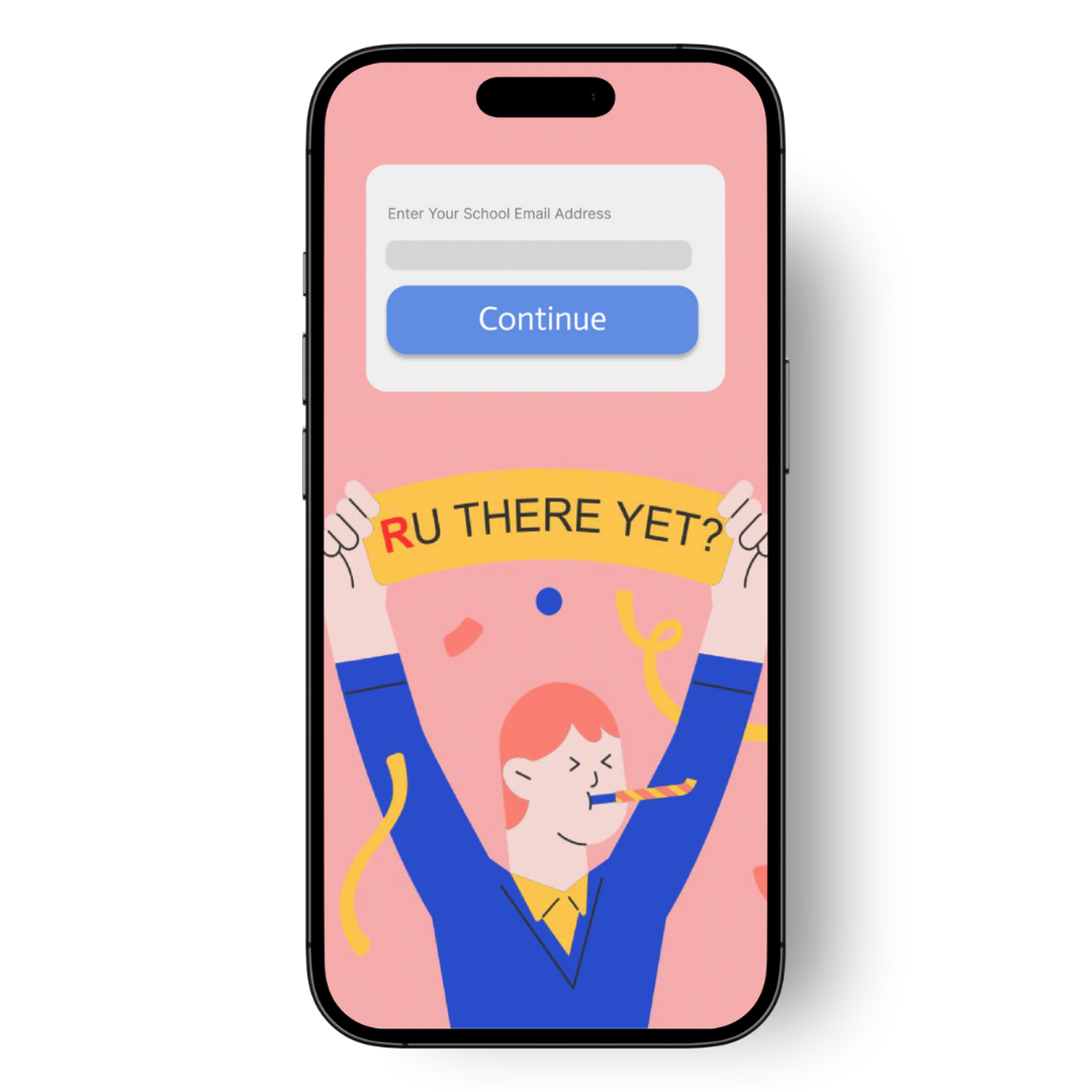
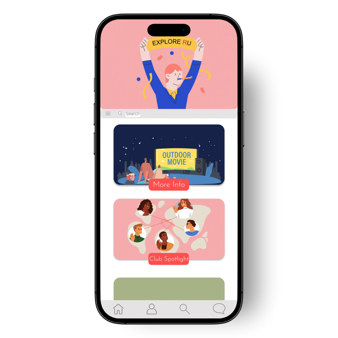
The homepage was the foundation of the app's user experience. I wanted it to be both welcoming and functional, serving as the central hub for navigation. To achieve this, I used an information architecture diagram to map out how users would access key features like event highlights, club discovery, and messaging. This ensured that the homepage was intuitive, organized, and provided quick access to everything students needed to stay connected on campus.
.png)
Architecture Diagram
Sketching was a key step in my process, helping me quickly visualize ideas and experiment with layouts before moving to digital designs. It allowed me to focus on functionality and gather feedback early, making it easier to refine the structure and ensure the design met user needs.

After sketching a couple iterations of possible designs, I moved onto developing low fidelity wireframes that would be used in my next phase of testing with my participants to allow them to get a feel of how the app would look.

Goals for Testing
01: Test overall app functionality and ease of navigation.
02: Measure how effectively users can discover and join events or clubs.
03: Evaluate the user experience with real-time messaging and communication tools.
04: Assess how intuitive and helpful the homepage and event discovery features are.
05: Gauge users’ overall satisfaction and motivation to regularly use the app.

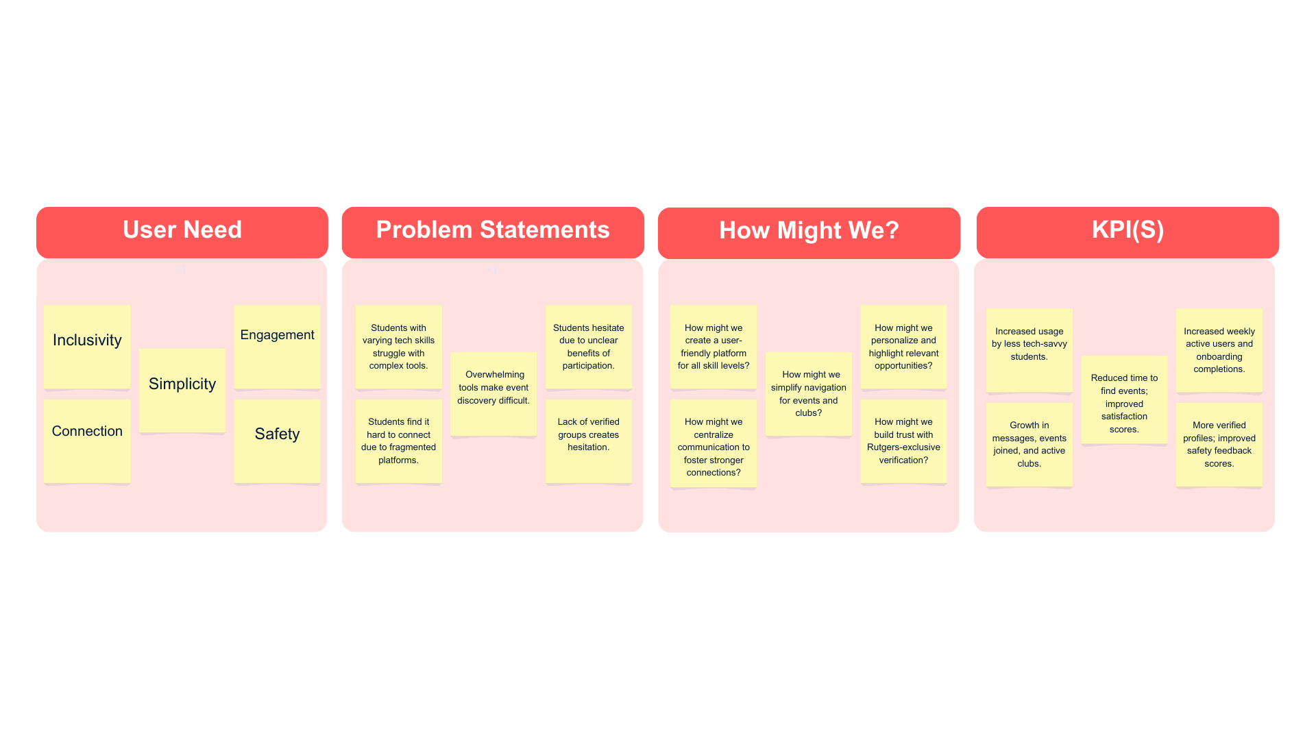
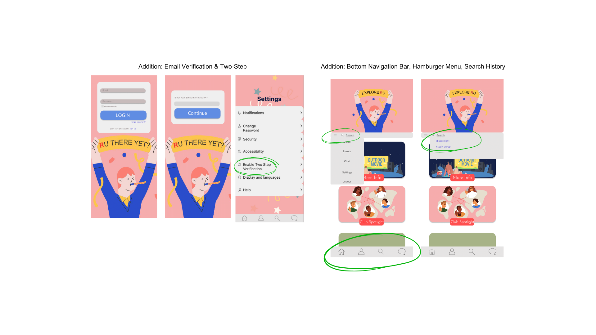
These insights will guide the next iteration, focusing on enhancing usability, improving safety features, and providing tools that make the app even more engaging and student-friendly.


Design, for People.
The biggest challenge I faced while designing RU There Yet was finding the balance between functionality and personalization. With so many students coming from different backgrounds, interests, and levels of involvement on campus, it was tough to create something that felt relevant to everyone.
At first, I focused on adding as many features as possible to appeal to a wide audience. But through testing, I realized that students didn’t want an app packed with endless options—they wanted something simple, intuitive, and tailored to their needs.
A special shoutout to the Rutgers Rock Climbing Team for their help during this process. Their feedback, along with others’, taught me to prioritize a flexible, user-centered design. Instead of cramming in every feature imaginable, I focused on creating a streamlined set of tools that students could make their own. This shift made the app feel more personal and much easier to use, which was ultimately the most rewarding takeaway from this challenge.